iZotope Product Design: Creating the Gauge
Product design is important to us at iZotope. In this article, Manager of Product Design Brian Desmond covers design strategy for our newest control.
You may notice that we have a new type of control in Neutron 3. While it might not be a radical change from the controls you’re used to using in our plug-ins and others, we believe it’s a nice step forward for our products. Introducing: the Gauge.
Meet the Gauge
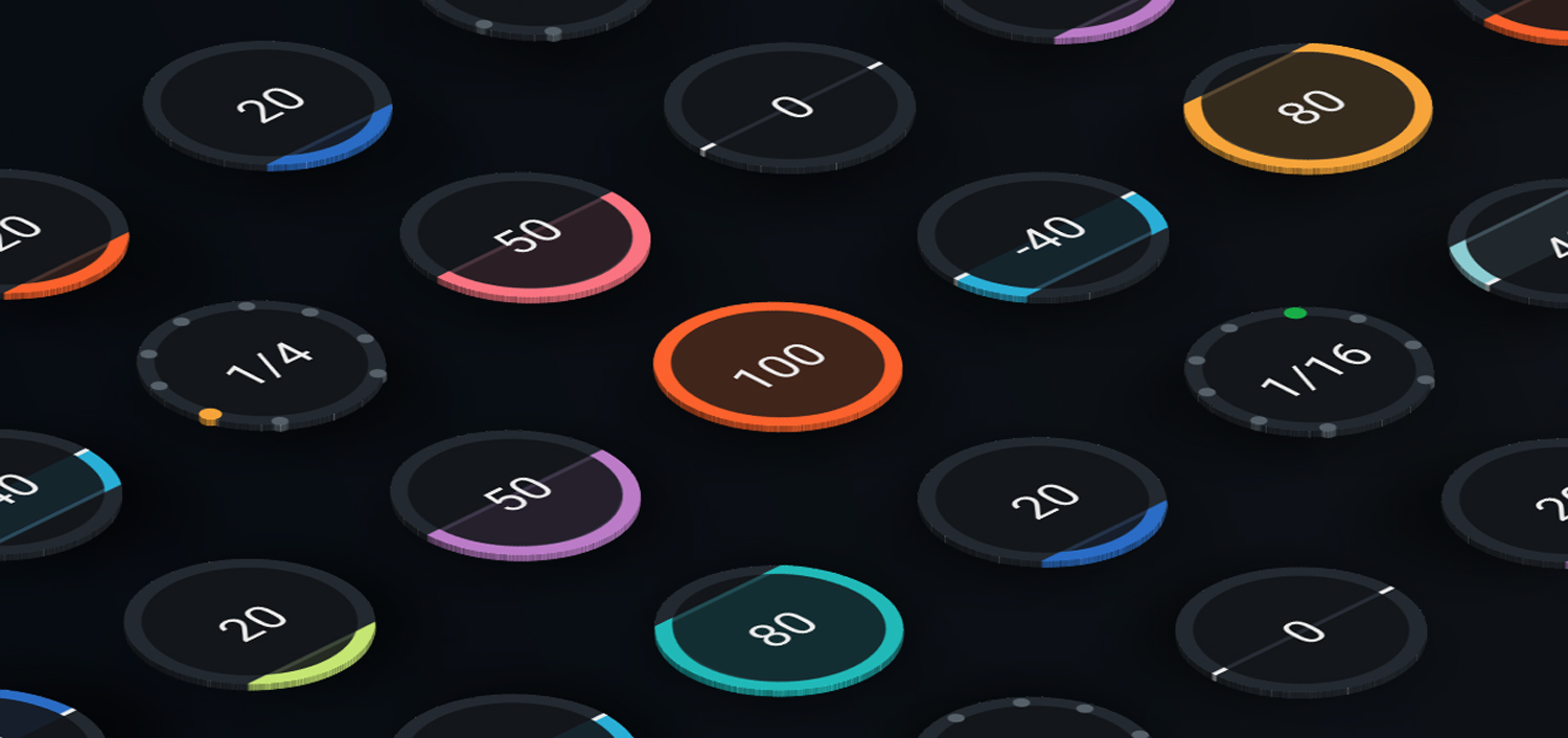
The Gauge
The Gauge is a natural evolution of the widgets commonly found in plug-ins, namely knobs and sliders. When we started design work for Neutron 3—a powerful and complex plug-in—the Product Design team chose to use knobs as the primary widget to help make room for beautiful, smooth visualizations.
When we started to show our initial designs to the rest of the team, a healthy debate about the advantages and disadvantages of knobs and sliders arose:
Knobs
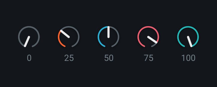
Knobs at various positions
You’re probably used to interacting with knobs if you’ve used audio software, but they actually aren’t very common outside of our industry. Apple’s Human Interface Guidelines call them Circular sliders, and they don’t even exist Microsoft’s Design Guidelines for Windows.
The main benefit of using knobs is that they take up less space than other controls, allowing more parameters to be displayed in a smaller area on a screen. This means that visualizations can occupy more space. However, knobs can feel strange to use for a variety of reasons and are therefore a pretty rare control in software design:
- Knobs rotate in a circular motion. In a physical, real-world context, this movement makes knobs easy to use, as we can do this pretty easily with our hands. This is why it makes sense for hardware, from mixing boards to synthesizers, to use knobs as one of the main types of controls.
In a digital context, this circular rotation is an awkward gesture to make with a mouse, and even worse on a trackpad. Therefore, we need another way to control the knob’s position. - Most digital knobs solve this problem by rotating according to up/down cursor movements. Up will turn the knob clockwise, down will turn it counter-clockwise. This is a more natural gesture, but isn’t connected with the rotational movement that we see.
- Because a knob’s indicator is located at the edge, it’s more difficult to quickly compare the levels of adjacent knobs.
Sliders
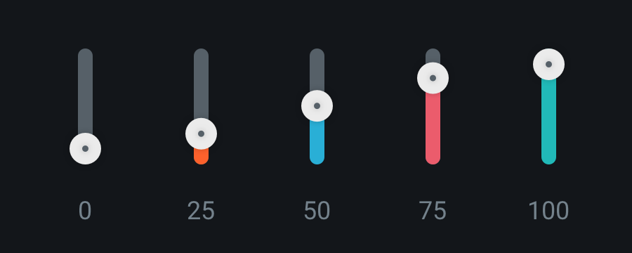
Sliders at various positions
Sliders, on the other hand, are great for seeing relative levels—one reason why they’ve been used for level faders in both physical and digital mixing consoles.
However, like knobs, digital sliders come with their fair share of less-than-ideal qualities:
- In general, because of their linear nature, sliders take up more screen real estate than knobs. This leaves less room for additional parameters and detailed visualizations.
- It’s expected that a slider’s indicator will follow the user’s cursor position when dragging. User input and visual feedback will seem disconnected if the slider moves at a different speed than the cursor. Because of this, a slider’s resolution is limited by its length. This poses a bigger problem in connection with #1 above, as a more precise slider has to take up more space.
- Sliders come with an expectation that you can click anywhere along them to move the indicator, which often jumps to wherever the user clicks. In audio production, which can sometimes demand precise adjustments, it can be frustrating to have your indicator jump to a new position when you only wanted to make a small change. (This frustration is exacerbated as DAWs often steal keystrokes, which can sometimes make it challenging to undo actions within a plug-in.)
In the past, we’ve leveraged knobs and sliders to their own strengths. Generally, we’ve used groups of sliders for easier level comparison and groups of knobs when screen real estate was at a premium. This has worked well for us over the years.
However, as we found ourselves debating the pros and cons of these widgets, we realized something: knobs and sliders are so ubiquitous in our industry that we’d never considered the possibility that neither was the right choice, or that there might be an opportunity to improve upon them. Just because something is commonplace doesn’t mean it’s the best choice.
We wanted a widget that could combine all the benefits of both knobs and sliders, optimized for true human-computer interaction rather than the traditional, skeuomorphic designs often found in audio software.
Scrub text
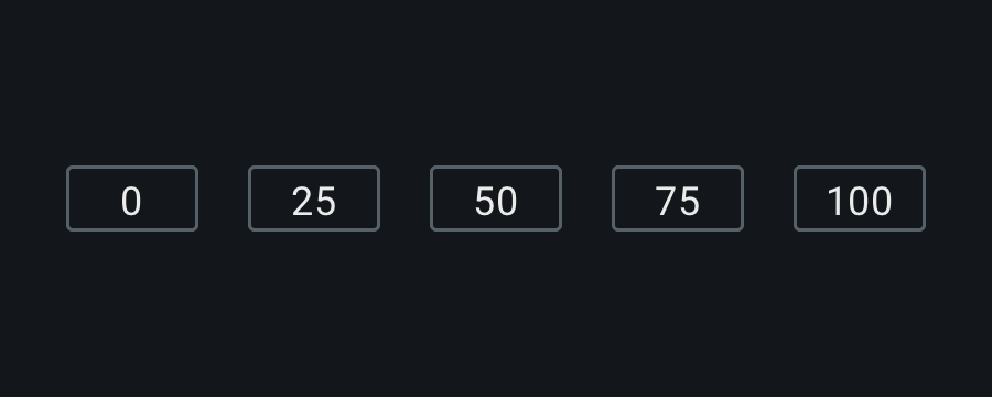
Scrub text at various positions
The first alternative control that we looked at was scrub text, a simple readout that can be adjusted either by dragging up and down or sometimes with clickable arrows to move the parameter incrementally.
After seeing other great examples of scrub texts in our industry, we wondered if we could employ similar controls for the majority of our parameters in Neutron 3. With the right typography and dragging sensitivity, perhaps something simple could serve as our primary widget.
While this experimentation worked to some extent, we missed having visual indicators of range and position.
The solution
We began mocking up some alternative controls, aiming to clearly present the control’s purpose, range, current value, and unit of measurement, all while optimizing for a small size to clear up screen real estate.
Here are a few of the early concepts that we worked on:
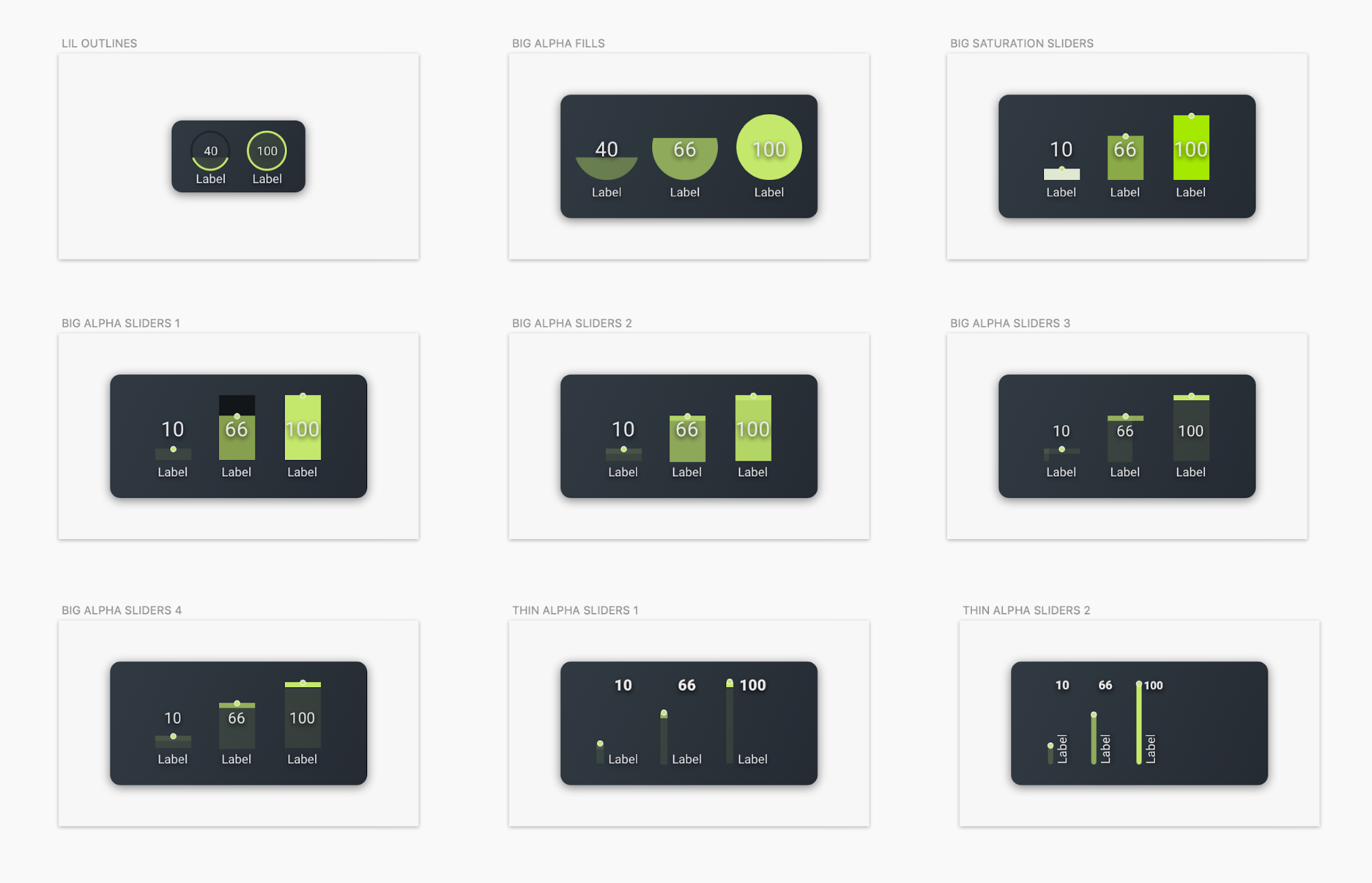
Early concept sketches
As you can see, most of them are simply elaborations of sliders. However, we were intrigued by the concept of using the outer ring of a circle to show level. Mocked up by our UI Designer Jamie Chaves in the top left example, it seemed to display relative level well and achieve a small size, our two main concerns with existing controls.
We wanted to build a prototype and test it to see if this was truly the improvement we wanted it to be. Mike McNasby, our Manager of Platform Design, joined us in our pursuit and contributed by building a quick prototype on CodePen.
When we tested the prototype internally, we quickly knew we were on the right track, but we discovered that it needed additional details:
- We wanted the center fill of the Gauge to illuminate as it increased in value, an idea taken from some of our other concepts above.
- Once the user clicks on the Gauge, we wanted the parameter label to show units.
- In place of a cursor state, we wanted arrows to appear on demand within the Gauge to guide users toward moving the control up and down. When the Gauge is at either extreme, only the arrow pointing in the available direction shows.
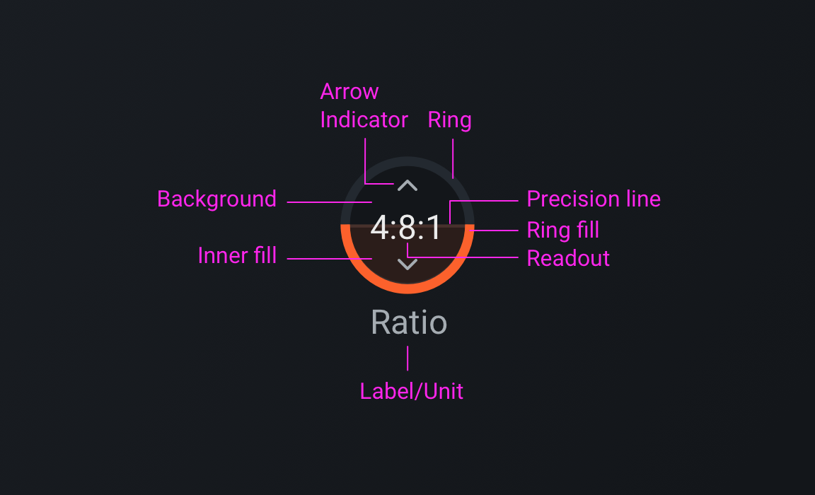
Anatomy of the Gauge
These little niceties and enhancements not only increase usability, but they also make Neutron 3 more enjoyable to use.
After a few rounds of enhancements, we spoke with customers to make sure we were creating something that would improve upon the status quo. While a few users needed some time to adapt, the majority either really enjoyed it, or didn’t notice at all—a good sign that we were enhancing our control without inhibiting anyone’s workflow.
Conclusion
So what would Neutron 3 have looked like without our healthy internal design debate and some problem solving? Probably something like this:
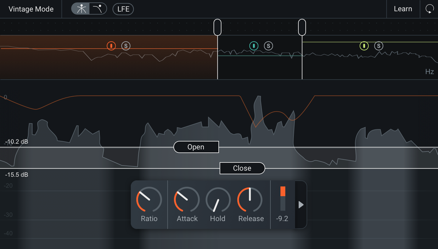
Neutron 3 with knobs
While the knobs that we began with would have worked fairly well, we think that the Gauge improves the overall experience of using Neutron 3 (especially when making fine-tuned adjustments in the Compressor and Gate modules).
We hope you’ll enjoy the Gauge some of Neutron 3’s other finer details as much as we enjoyed making them.
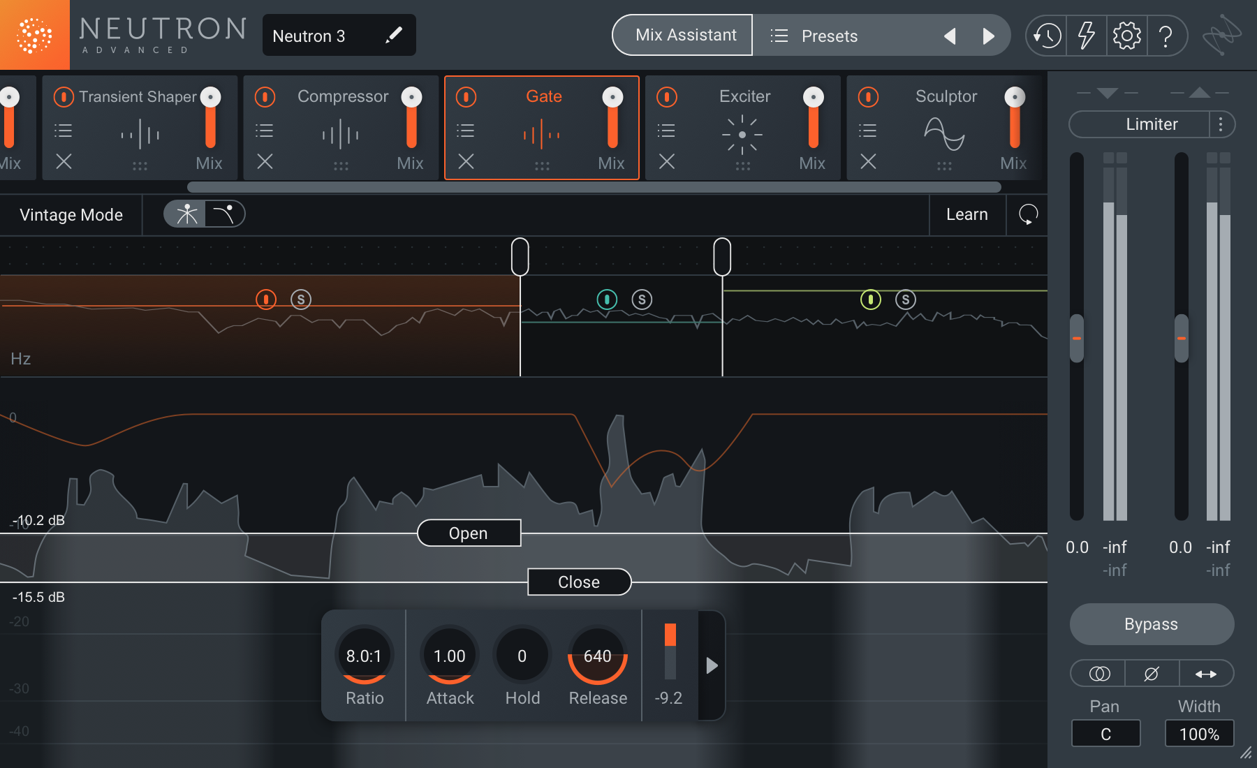
Neutron 3 with Gauges

